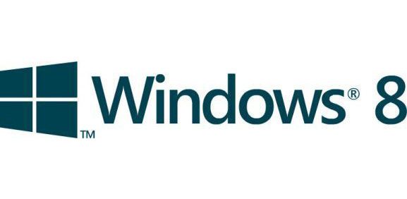
Windows 8 logo now following the new interface
Andy Ruffell / 12 years ago
The past few months saw the use of various logos reflecting the upcoming operating system from Microsoft, Windows 8, which has recently been attributed an official logo with the previous trademark receiving a facelift.

The new face of Windows, less colourful than the previous ones
This update is in connection with the new user interface implemented into the new OS. Called “Metro”, this new interface brings the various information (such as smart application, shortcuts, gadgets, images, etc.) in an interactive organization made of rectangular ’tiles’.
The reflection of this new interface makes the new trademark flat, angled and with all rectangles on the same plane. One thing this new logo lacks of, unlike its previous versions, are colours, the new logo featuring a sort of dark blue with a shade of green.
As for its popularity, it remains to be seen if the new image of Windows will win the heart over Seven’s current users.

On the other hand, Seven's trademark, full of colours
Source: CNBeta


