UI updates are probably one of the riskiest kind of updates you can make for an app. On the one hand you can improve certain things but on the other you can completely ruin muscle memory. One of the biggest culprits for this is Spotify who keep changing tiny little features and throwing me off everytime. Now Discord has updated the UI for their mobile app alongside a few other changes.
The new Discord Mobile update is being rolled out from today and is said to improve the way the app is used, all the improvements are listed below.
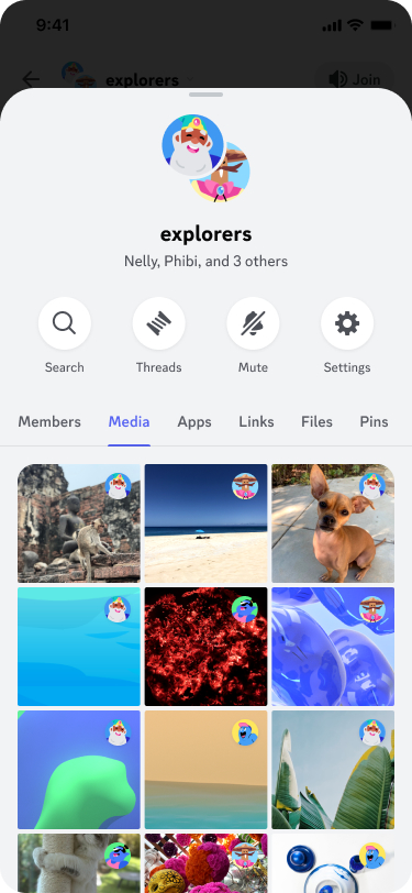
Out of all of this, I’m happy to see the improvements for media sharing, as the mobile app often has issues with loading images even when using a strong connection. Load time improvements are also very welcome and the midnight theme even more so. I haven’t received this update yet but based upon the shared images, it does look better especially with messages getting a dedicated tab.
Searching for shared media images is a lot easier as well and you no longer need to input some convoluted search to find an image as all shared images can be viewed within a single tab.
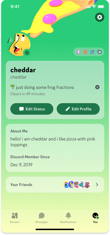
Replying is also smoother with a swipe to reply function and the notifications tab has been streamlined with a single tab for all notifications rather than separated by for you and mentions. The profile tab has been altered to appear more like the profile tab other users see when clicking your profile and all the settings will appear under a cog in the top right corner.
The redesign overall appears to line-up much more closely with other messaging apps which should make it much easier to navigate thanks to the familiarity. Further details on the changes can be viewed at discord.com.
AMD has launched (thanks Wccftech) its new Ryzen 7 8745H APU, a part of the…
MSI has announced a new BIOS update in mid-August to address stability issues with Intel’s…
Many PC models from top brands have faced security breaches due to a weak BIOS…
Ahoy, Straw Hat fans! The wait is finally over. The beloved RPG adventure, ONE PIECE…
【Wireless & 1800mAh Battery Operated】Touch lamps bedside use a rechargeable large capacity battery of 1800mAh,…
Click to open expanded view F Energy efficiency label Product Sheet Lepro GU10 LED Bulbs, Warm White…