Nvidia Shield Tablet Android 5.0 Lollipop Review
Peter Donnell / 9 years ago
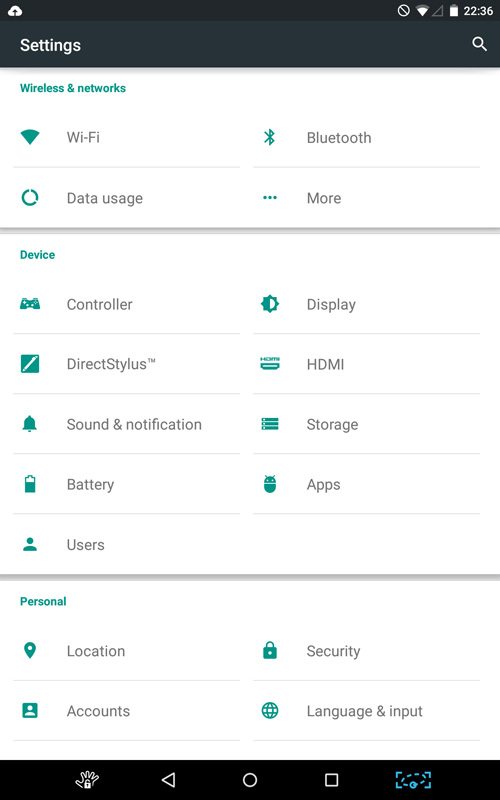
User Interface
The new Android 5.0 update marks the biggest update to the worlds most popular mobile OS in several years. It’s been tweaked and improved in almost every respect, with the added bonus of an almost complete overhaul to the UI.
The UI is something that Google are calling their “Material Design”. Something they hope will prove even more competitive against the recent updates to iOS. It offers a new look, improved functionality and more features.
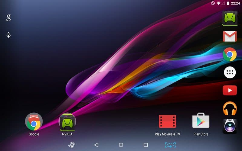
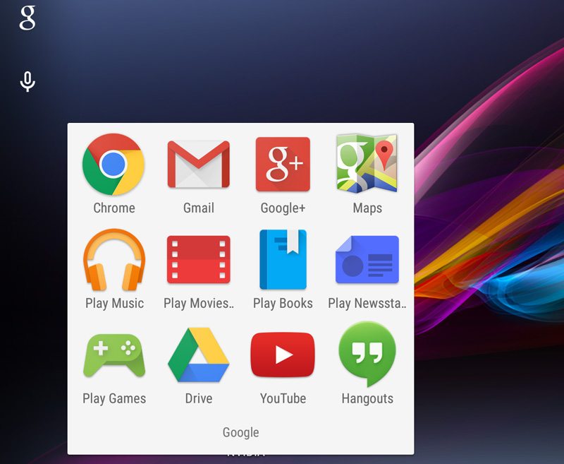
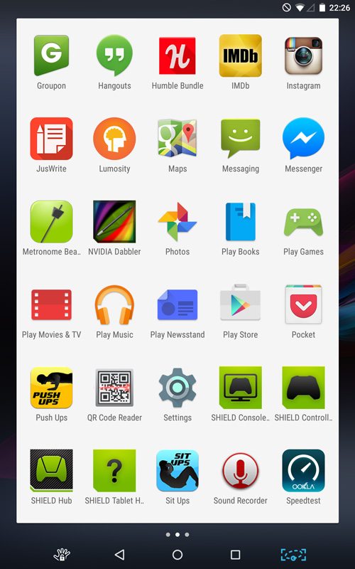
The bold looks of the previous Android releases are gone, in fact they’re almost completely gone! Everything has been changed in favour of the new softer textured colours. The interface is bright and clear with an appeal that is much more simplistic and inviting overall. The idea is to take some of the fuss out of using an Android device and initial impressions are very good. This feels like a completely new tablet! The new aesthetics are bolstered by a range of new transition effects and smoother animations, that make the whole navigation a more unified and friendly experience.
It’s certainly not perfect, although I guess it would also be arguable that many aspects are subjective. It’s clear that Lollipop is the groundwork for what will become an even better OS over the coming weeks, months and even years to come. Animation transitions could be a little swifter, some of the tab headers and buttons functions can be a little unclear at times too. These are minor quibbles and nothing you don’t become accustomed to after a few hours of usage; although still something that can be easily fixed in future revisions to the OS.
Notifications have been greatly improved in Lollipop. While you can still control and respond to messages from social media, text messages, emails and more from the slide down notification bar, you can also do it from the lock screen.The humble lock screen is certainly becoming more the default quick-use screen, with all of the more complicated functions being left on the main desktop should you need them. You can tweak each apps level of interaction with the lock screen with a simple long press on the notifications. If you set them private then they won’t show on the lock screen. You can also fully disable per-app notifications and of course you can dial them up to full and get all of the information you need at a glance. This is further enhanced by an improved volume control slider, you can silence all notifications, or leave the device in Priority Mode; just enough to let the important things get through.
Toggling between apps is now much easier, as you get large cards to flick through on a large carousel. This is great at you can easily see emails, messages and more as you scroll through them.