Cooler Master GM2711S 180Hz Gaming Monitor Review
Peter Donnell / 4 months ago
Performance
>
The Cooler Master GM2711S looks great, and while you’ve likely seen a few hundred 27″ 1440p monitors and they’re all starting to look the same, the slim bezel and the distraction-free frame and minimalist logo are certainly welcome here.
The panel looks great too, the colour pops and while I’ve already said it before, the ART coating on it does a wonderful job of preventing reflections on the screen and even direct lighting gives off little more than a diffused glow, so it’s great for brighter rooms.
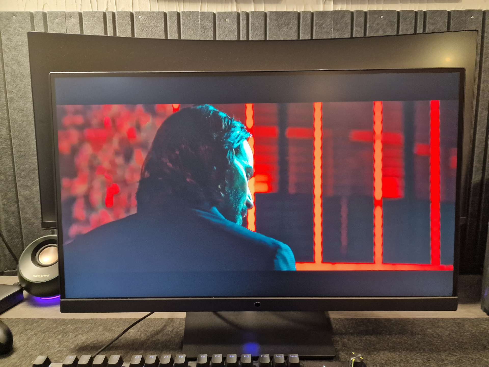
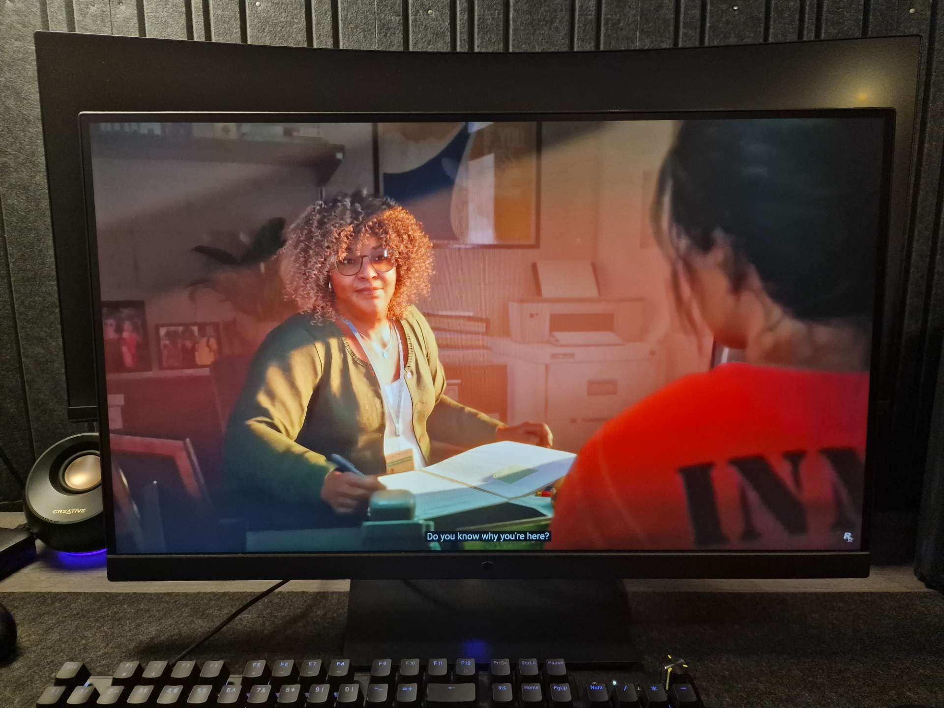
The colours are awesome, and with great colour reproduction out of the box, both SDR and HDR content look vibrant, with good black levels and a decent contrast ratio.
Watching a movie in HDR does lend to some glow with the brightness maxed out, but honestly, it’s about what I’d expect from HDR 400 on an edge-lit panel, but the colours look amazing, and while I wouldn’t use this mode for darker movies, it looks great while gaming in something like Horizon Zero Dawn.
The 2560×1440 resolution is great for work, gaming, media consumption and whatever else really, for a 27″ panel it offers an excellent pixel density, so the image always looks crisp and clear.
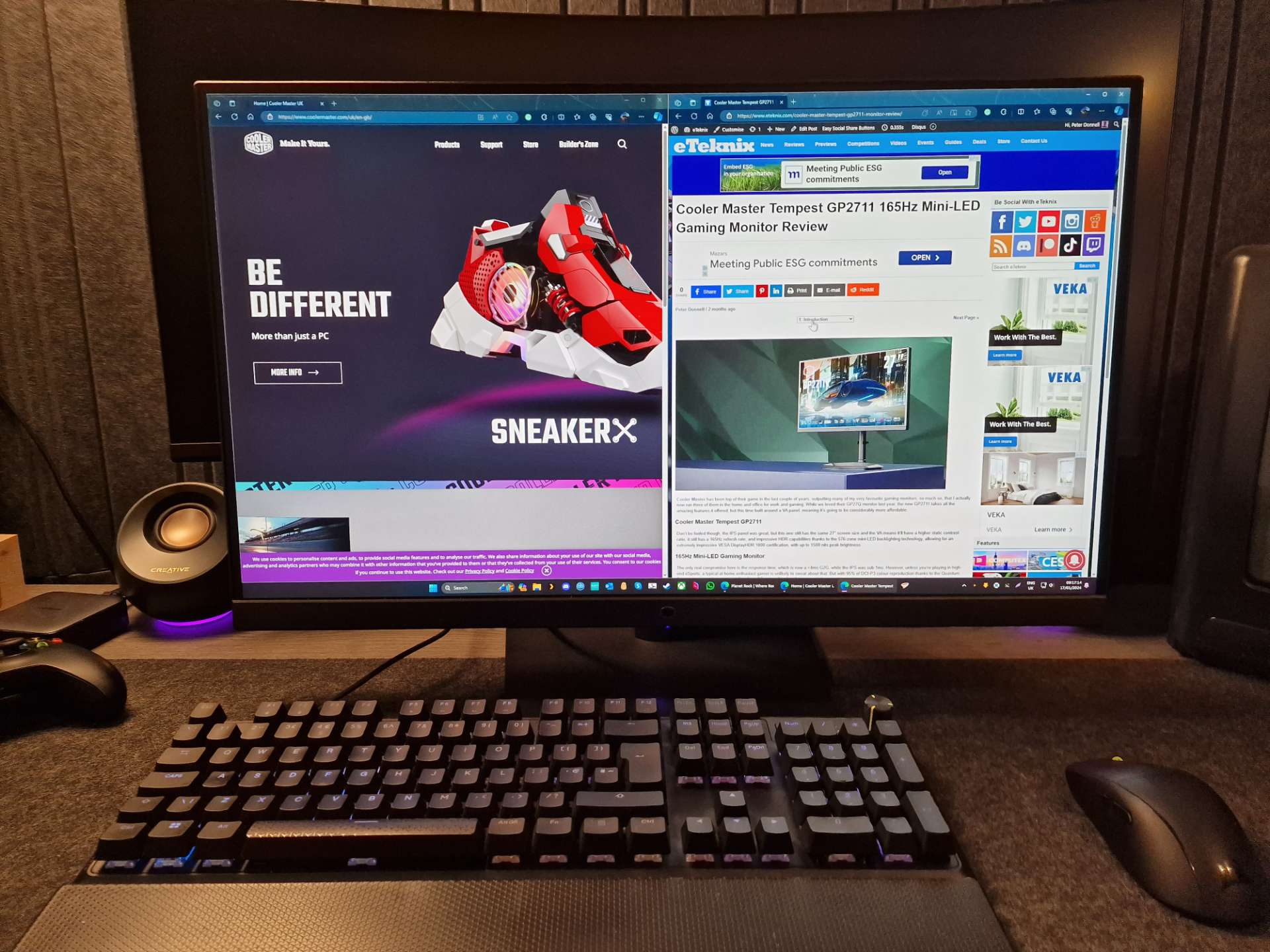
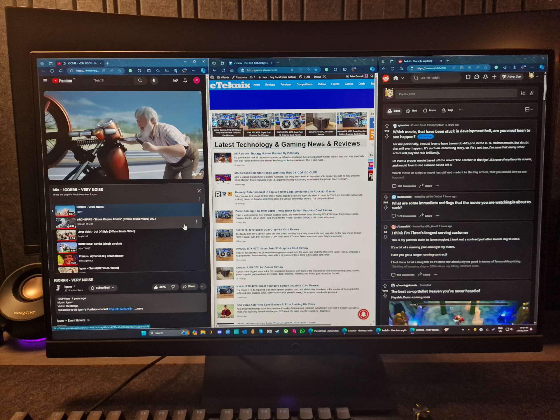
The screen is great for side-by-side content, but even with three windows side-by-side, readability is still very good, you’ll likely have to zoom out on a few web pages to ensure the text fits within the frame, but overall, it scores well for productivity.
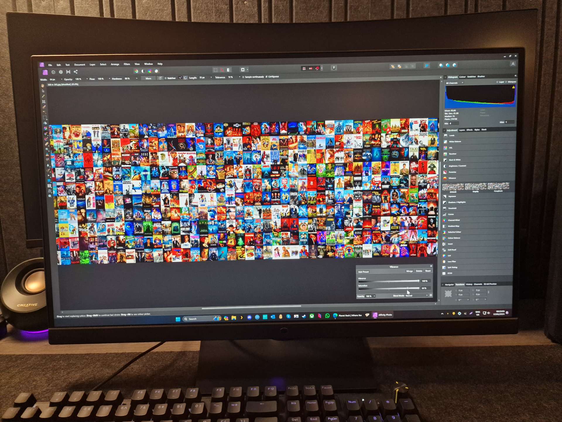
The colours on this monitor are very good for this price range, and while it’s not high-end accurate, it’s good enough for most users like myself to edit review photos, do some video editing etc.
For gaming, it’s a beast, at 180Hz and with a Fast IPS panel, motion clarity is sublime, with no issues in blurring, no ghosting or any other annoying quirks, it just looks great.
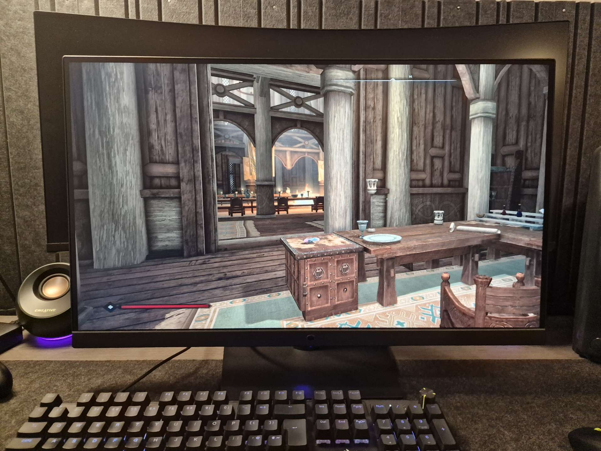
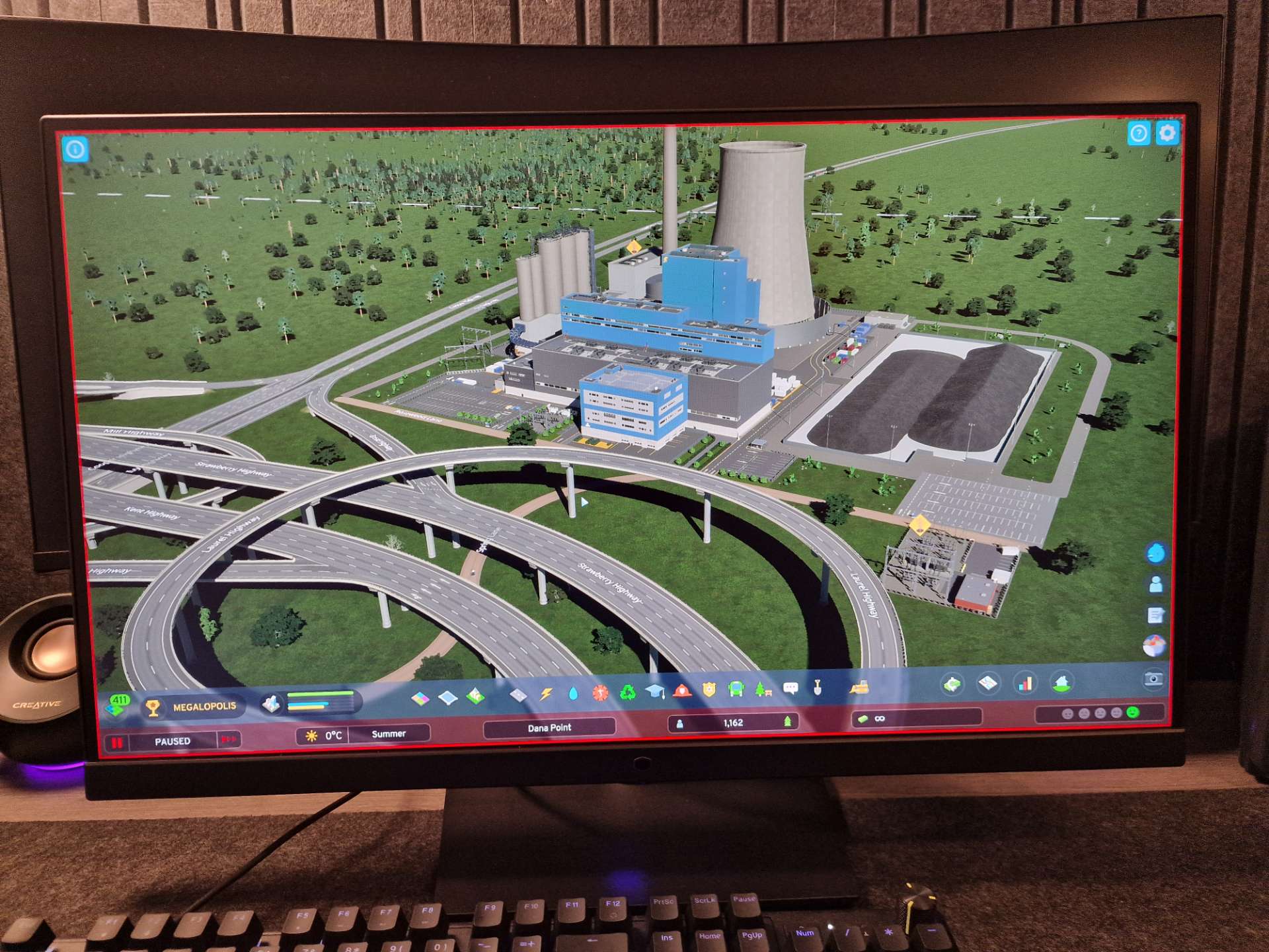
The resolution and colour reproduction make any game look great, and while my competitive shooter days are seemingly behind me, I quite enjoyed kicking back with some Cities Skylines 2.
Robocop looks great, with really nice black levels, vibrant colour and again, silky smooth motion. It looks a little washed out in this picture, but it’s rather bright in here and looks better in person.
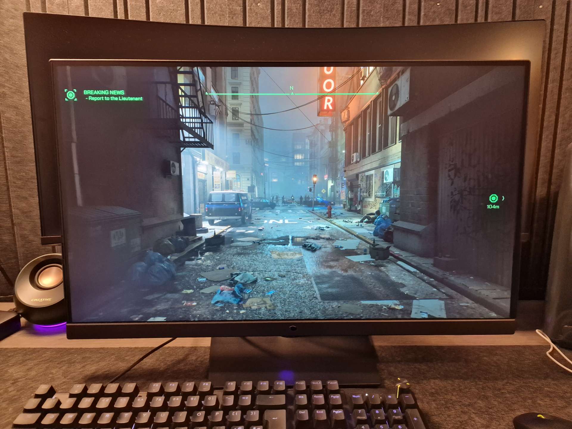
As you can see, the sun wasn’t pounding my windows for a moment and the colours and black levels really do pop off the screen quite nicely.

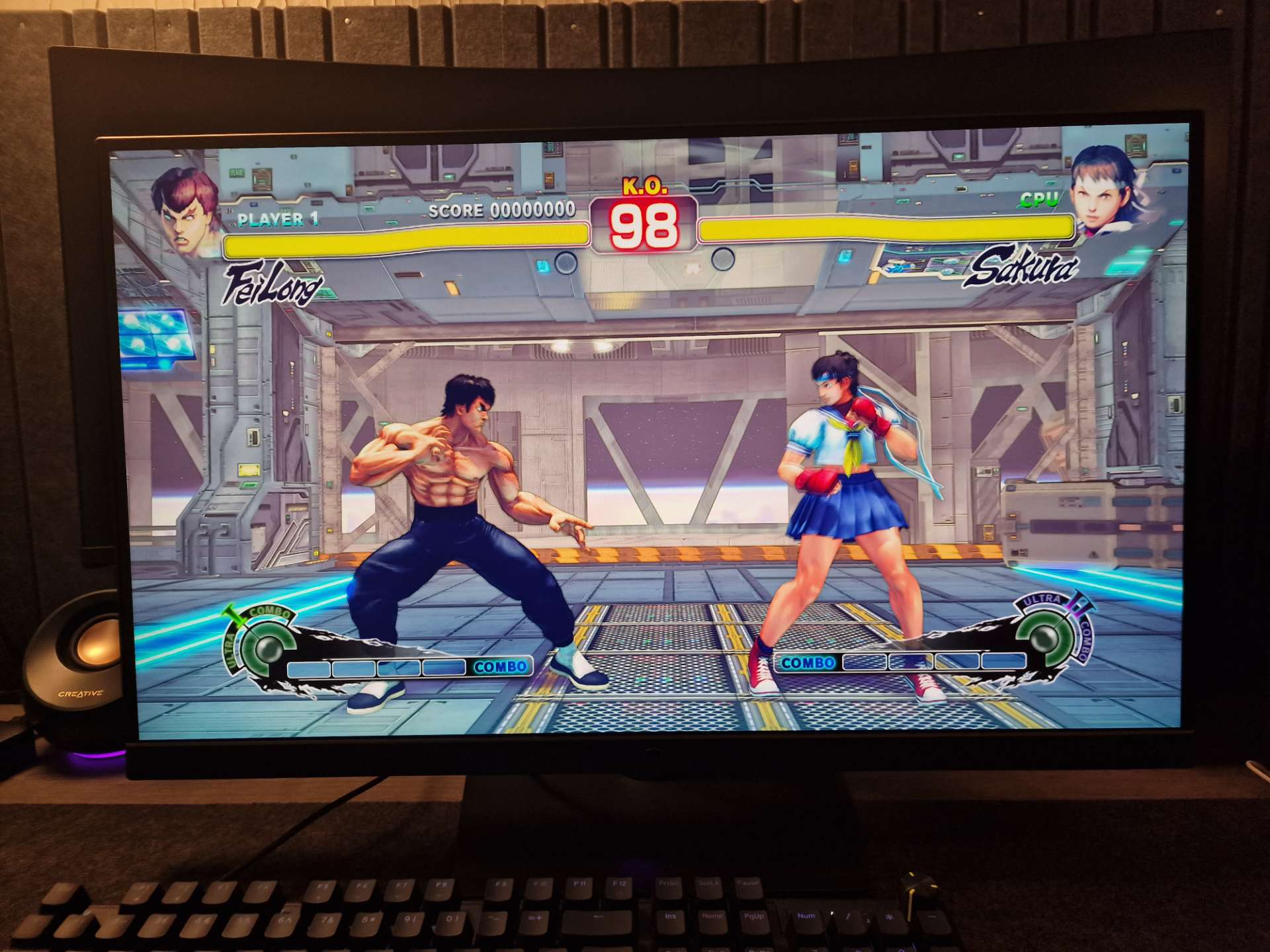
…be rude not to have a cheeky game before I get back to writing.
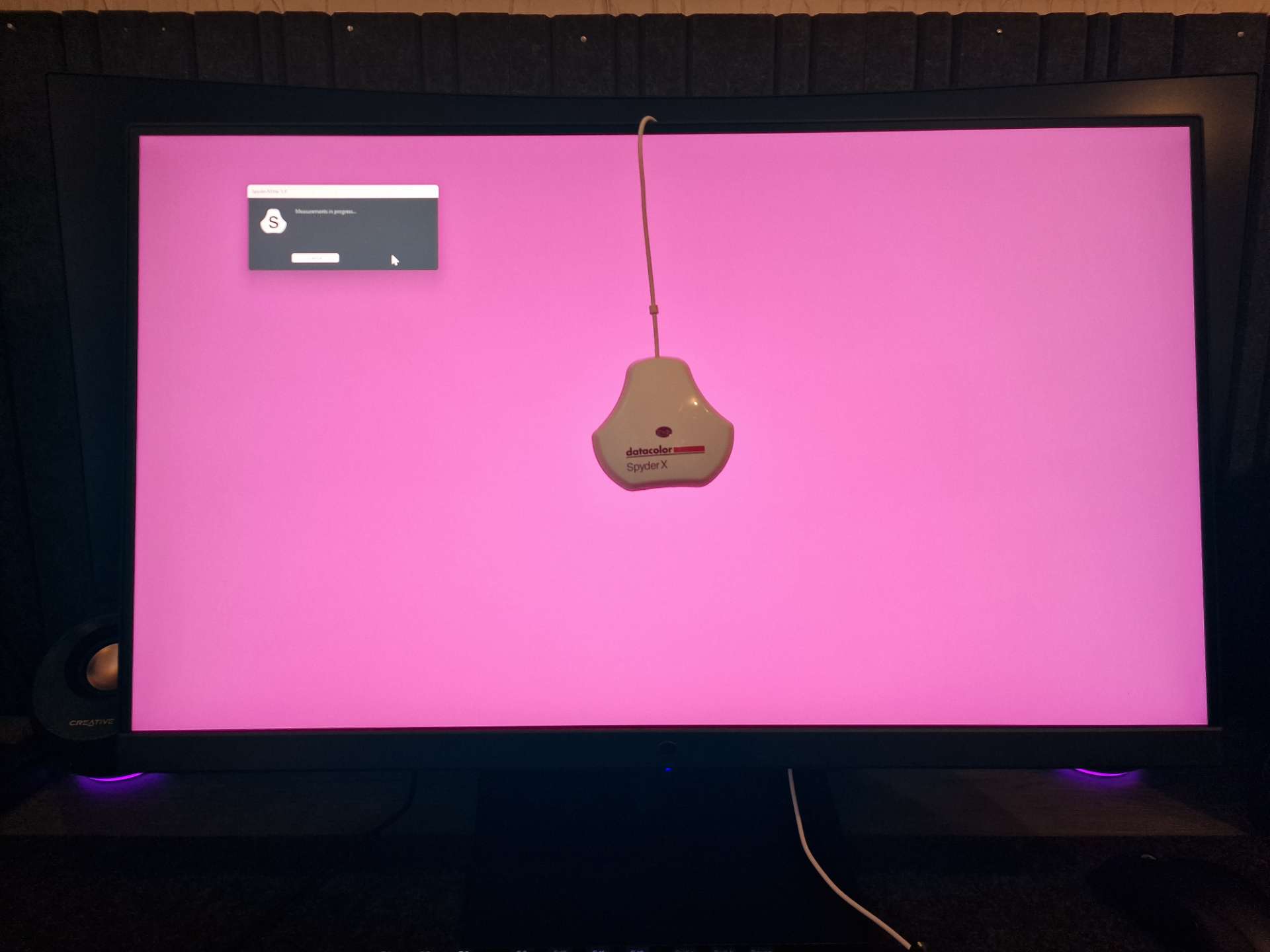
And now it’s time to check the colour calibration, join me on the next page for the results!